


















What Is The Most Attractive Shape In A Logo?
One of the most important parts of logo design is its shapes. They can make a logo appear friendly and powerful, as well as modern

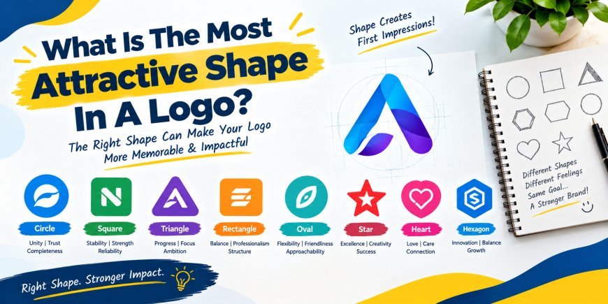
One of the most important parts of logo design is its shapes. They can make a logo appear friendly and powerful, as well as modern, elegant, or creative. Before anyone reads the brand name, the shape can catch their attention. A well-crafted design can help a company build a clear image and create a logo that's easy to remember.
Explanations are the following:
No one size fits all brands. Nevertheless, circles are among the most attractive and versatile logo shapes. They offer a balanced, flowing look that can evoke togetherness, trust, and friendliness. Squares, triangles, and organic forms can also work, as long as they fit the brand and the message.
What is the significance of shapes in logos?
A logo is not just an image. Each element of a logo can convey a message about a company. Shapes can make people feel something when they see a sign. A smooth, curvy shape can feel friendly, whereas a sharp shape can look strong or vigorous. This makes shape choice a significant part of the design process. The right shape should support the brand's personality rather than being chosen simply because it looks good.
Are Circles The Most Appealing Shapes of Logos?
Circles are among the most commonly used shapes in logos. Their rounded contours make them look even and likeable. Circles are less harsh than sharp edges and can feel softer and friendlier.
Circles can also convey unity, connection, completeness, and continuity. Corporations that want to build trust and community can find these ideas helpful. Their simple, recognizable design also makes circular logos easy to identify at varying sizes.
Why Are Circles Such a Good Idea?
One reason circles are effective is their simplicity. A simple circle shape is detected in a short period of time by the human eye. This makes the shape advantageous for brands seeking a memorable identity. Circles also work well with text, symbols, and other design elements. The brand name may be located within and around the circle, or the circle may be perceived as a mere symbol. This flexibility makes circular designs work for most industries.
What Square Shapes Do They Communicate?
Logo design also consists of squares and rectangles. Their straight lines and equal sides can convey stability, order, and reliability. Businesses in the technology, financial, construction, and professional services industries can use these shapes to create an effective visual impact. A professional logo design service can combine shapes, colors, symbols, and typography in a balanced way.
A square badge can appear neat. It also works well in digital environments, as many websites and social media platforms are square-based. Nevertheless, it must not be so creative that the design looks dull.
What Do Triangles Represent?
Triangles are more vivid-looking. The edges of their bodies can indicate movement, direction, progress, or strength. For this reason, triangles work well for brands that want to show dynamism or progress.
A triangle's direction can also add meaning. A triangle with its base facing upwards can indicate growth or improvement, but other designs can create different impressions. Use triangles cautiously, since sharp angles may feel more nightmarish or violent to designers.
Do Organic Shapes work with a logo?
Organic shapes are not as regular as circles, squares, and triangles. They can resemble things in nature, like waves, leaves, drops, or flowing shapes. These shapes can feel creative, natural, relaxed, or friendly.
Organic shapes can suit companies in nature, wellness, food and beauty, or creative sectors. They can give a brand a more human look and help it stand out from logos that use classic geometric designs.
What shapes and colors to use in your logo?
The best shape depends on the brand. Before choosing one, consider the nature of the business the shape will represent and how customers will perceive it. A brand that wants to be seen as trustworthy may need a different form than a brand that wants to be seen as playful and creative.
Make the Shape Simple
A good logo shape must be recognizable. It is easy to overload a design with lines, patterns, and minor details that make it hard to understand. A straightforward form is easier to recognize when printed on a business card or shown as a small social media snapshot.
A simple logo can also be more flexible. It can be applied to websites, packaging, signs, uniforms, advertisements, and other materials and still retain its visual appeal.
Combine Shapes Carefully
Designers can use various shapes to create a distinctive logo. For example, a circle can be paired with a simple symbol, and a square can include a letter or icon. By merging shapes, designers can add meaning without complicating the logo.
Nevertheless, every element must be purposeful. A logo can look busy when it includes too many shapes. A symmetrical design is easier to understand and remember.
Establish the logo as easy to identify.
A memorable logo should also be appealing. It should be easy to identify so people don't waste time on it. A simple, unique form can support this recognition.
One should also ensure the logo is not too close to competitors'. Studying other brands may help designers create something new. A logo can be unique and creative through simple elements.
Conclusion
Circles have become one of the most appealing logo shapes because they appear simple, balanced, smooth, and friendly. They may symbolize unity, relationships, and wholeness. Circles are not, however, always suitable for every business. Strong logos can also be created with squares, triangles, and organic shapes, as they align with the brand's personality.
The most appealing logo shape conveys the right message and reaches the target group. An effective logo must be simple, memorable, unique, and convenient to use on a variety of platforms. Businesses should choose the right shape and pair it with appropriate colors and typography to create a logo that is not only appealing but also meaningful over time.
What's Your Reaction?
 Like
0
 Dislike
0
 Love
0
 Funny
0
 Angry
0
 Sad
0
 Wow
0