







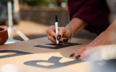





Top Design Tips for Custom Banner Printing That Captures Attention
A banner gets about three seconds. Someone is driving past, wandering through a mall or walking between exhibition stands, and in that window they either get your message or they don't.
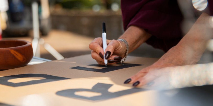
A banner gets about three seconds. Someone is driving past, wandering through a mall or walking between exhibition stands, and in that window they either get your message or they don't. Most of the time they don't, and the printing is rarely to blame. The problem is the design decisions made before the file reaches a press.
A good signage company Dubai businesses trust will handle materials, finishing and installation. What it can't do is rescue a design that tries to say too much. These are the choices that decide whether your banner gets noticed.
Start with the viewer, not the layout
Before you open a design program, answer two questions: how far away will people be, and how fast will they be moving? A banner above a mall entrance is read by people strolling past. A banner on a main road is read by drivers with a couple of seconds to spare. The second needs far fewer words and much bigger letters.
Tell your supplier this up front, because viewing distance drives almost every other decision.
Say one thing
The most common mistake is cramming in every service, three phone numbers and a social media handle. Nobody reads it. Pick one message and make it the headline: "Now Open", "Sale Ends Friday", "Now Hiring Drivers". Three to six words is a sensible ceiling, with contact details underneath in smaller text. To test it, show the design to someone for three seconds, take it away and ask what it said.
Choose contrast over cleverness
Pale text on a pale background disappears, however stylish it looks on screen. The reliable pairings are the plain ones: black on yellow, white on navy, white on deep red. If text sits over a photo, put a solid colour panel behind it or darken the image.
A quick check is to view your design in greyscale. If the headline still stands out without colour, the contrast is working.
Size the letters for the distance
Text that looks huge on a laptop shrinks fast once it's printed and hung. A common trade rule of thumb is roughly one inch of letter height for every ten feet of viewing distance, and that's a best case. Stick to bold, simple sans serif lettering and use two fonts at most. Thin scripts look elegant on an invitation but blur into nothing on a banner.
Keep images sharp and margins safe
One strong image beats a collage. Whatever you use must be high resolution at the final printed size, so a small web logo stretched across two metres will look pixelated. Supply logos as vector files where possible.
Keep anything important well inside the edges, since hems and eyelets eat into the border. Ask your printer for their recommended bleed and safe margins.
Design for Dubai's conditions
The sun and wind will test your banner long after the design is approved. Ask your supplier how their inks cope with strong UV and how long they expect the print to last outdoors here. For windy spots, mesh material lets air through and reduces strain on the fixings, and a matte finish can be easier to read than gloss in bright light.
Then there's the paperwork. Under Dubai's Decree No. 6 of 2020, advertisements need prior permission before they go up, and the approving body depends on the location. Ask early whether your signage company Dubai quote covers the permit or only the fabrication, and finalise the artwork before applying. Changing it after approval can send you back through the process.
Plan the Arabic from the start
Many banners here carry both Arabic and English. Arabic reads right to left, so simply stacking it under the English can look unbalanced. Decide which language leads, make sure both can be read from a distance, and have a native speaker check the proof. Copying Arabic between design programs can break the letters apart, and it looks unprofessional immediately.
Check the proof, not just the screen
Screens use light and printers use ink, so bright blues and neon shades often print duller than expected. Ask for a printed proof before the full run, and send Pantone references if your brand colours matter. Before approving, print the design small on A4 and look at it from across the room. Spelling mistakes and tiny text show up quickly that way. If you've added a QR code, test that it scans.
Choose the right partner
When comparing a signage company Dubai offers, ask three questions: Who handles the permit? How do the inks and materials hold up outdoors? Will you see a proof before the full print?
A supplier who answers clearly, and asks about your viewing distance in return, is thinking about the same problems you are. Add a short headline, strong contrast and generous letter sizes, and your banner has a real chance of being the one people remember.
What's Your Reaction?
 Like
0
 Dislike
0
 Love
0
 Funny
0
 Angry
0
 Sad
0
 Wow
0