

























Understanding the Design Language Behind Saint Michael Clothing
Learn how Saint Michael clothing uses artwork, symbolism, typography, color, texture, and historical references to create a distinctive graphic streetwear style. This informative guide explains how to understand the design language behind modern graphic fashion and why details such as graphic placement, vintage-inspired effects, religious imagery, and visual contrast can influence the overall appearance of a garment. It also explores how Saint Mxxxxxx connects traditional references with contemporary streetwear and how shoppers can look at graphic clothing from a more informed perspective. Whether you are discovering Saint clothing for the first time or already interested in expressive streetwear, this guide offers practical insight into reading graphic designs, understanding visual choices, and finding pieces that genuinely match your personal taste and wardrobe.

Clothing can communicate ideas without using many words. A color can create a mood, a symbol can suggest a meaning, and a graphic can make a simple garment instantly recognizable. This is especially true in modern streetwear, where artwork has become an important part of how clothing is designed and understood.
Saint Michael clothing is a useful example of this approach. The style often combines strong imagery, historical references, typography, vintage-inspired textures, and dramatic compositions. These elements work together to create a visual identity that is different from plain casual clothing.
For someone discovering this style for the first time, understanding the design choices can make the clothing easier to appreciate. Instead of looking only at whether a graphic looks attractive, it is possible to examine how the different elements work together.
What Is a Design Language?
Design language is the collection of visual choices that gives a product or style a recognizable identity.
In clothing, this can include colors, typography, illustrations, shapes, textures, proportions, and placement. When similar choices appear across different garments, they can create a consistent visual style.
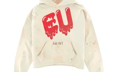
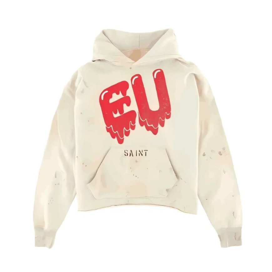
Think about a streetwear hoodie with a large illustration, faded colors, unusual lettering, and a vintage-looking texture. None of these elements works completely alone. Their combination creates the overall impression.
This is why two garments can have similar colors but feel completely different.
The design language comes from how all the visual parts are arranged.
Why Graphic Placement Matters
Where artwork is placed on a garment can change how the entire piece looks.
A small chest graphic may feel subtle and easy to combine with other clothing. A large front graphic can immediately become the main feature of an outfit. A back graphic may have a stronger visual impact when viewed from behind.
Some designs also use multiple locations, such as artwork on the front, back, sleeves, or hood.
When examining Saint clothing, looking at placement can help explain why certain pieces feel more dramatic than others.
The graphic is not simply an image. Its position becomes part of the design.
Understanding Typography in Streetwear
Words and lettering can be just as important as illustrations.
Typography refers to the style and arrangement of written characters. Different fonts can communicate different feelings. Clean lettering may appear modern, while rough or handwritten typography can create a more personal or vintage impression.
Streetwear graphics often experiment with scale and placement. Text may overlap an illustration, curve around an image, or appear deliberately uneven.
These choices can make the garment feel less like a standard printed shirt and more like a designed composition.
When evaluating a graphic piece, try looking at the lettering separately from the artwork. Ask whether the typography supports the image or competes with it.
The Role of Color
Color is another important part of graphic design.
A garment does not need many colors to create a strong visual effect. Sometimes a limited palette can make the artwork feel more consistent.
Neutral garment colors can also provide a background for more detailed graphics. Black, gray, white, cream, and faded tones are commonly useful because they can work with different parts of a wardrobe.
More colorful designs create a different effect. Bright or contrasting colors can make the artwork more noticeable and give an outfit a stronger visual presence.
There is no universally correct color combination. The important thing is how the colors support the overall design.
Why Vintage-Looking Graphics Feel Different
Many modern streetwear designs borrow visual ideas from older clothing and printed materials.
Faded colors, rough textures, worn-looking artwork, and imperfect typography can create a sense of age. These effects can make a new garment feel connected to another period.
This is different from simply making clothing look old.
Good design uses visual aging as an intentional part of the composition. The effect can create nostalgia, character, or a feeling that the artwork has a history.
This is one reason vintage-inspired graphics work well with streetwear. They give modern garments a visual connection to the past.
Understanding Religious Imagery in Fashion
Religious imagery has a long history in visual art.
Saint Michael is one example of a religious figure who has appeared in paintings, sculptures, manuscripts, and other artistic forms. Traditional representations often portray him as a powerful figure associated with protection and the defeat of evil.
When such imagery appears in contemporary clothing, it can be viewed from more than one perspective.
Someone may connect with the religious meaning. Another person may be interested in the historical artwork. Someone else may simply appreciate the composition and visual impact.
These interpretations can exist together.
Understanding the original context does not mean that every wearer must interpret the design in exactly the same way. Fashion often allows people to interact with familiar symbols through their own perspective.
How Saint Mxxxxxx Uses Visual Contrast
Saint Mxxxxxx is associated with a strong graphic aesthetic that often brings together elements that might seem opposite at first.
Modern and vintage. Clean and distressed. Traditional imagery and contemporary streetwear.
These contrasts can make a garment visually interesting.
For example, a traditional figure can be presented through an unconventional graphic treatment. An aged-looking print can appear on a modern oversized silhouette. A historical reference can be combined with contemporary typography.
Contrast gives the viewer something to notice.
It also helps explain why graphic streetwear can feel more complex than a basic logo-based design.
Why Imperfect Details Can Be Intentional
Modern consumers are used to seeing highly polished digital images everywhere. Because of this, imperfect visual details can sometimes feel more noticeable.
Rough edges, faded areas, uneven lettering, and distressed textures can create a handmade or historical impression.
These details should not automatically be interpreted as manufacturing problems.
There is a difference between intentional distressing and poor construction. Intentional distressing is part of the visual design, while defects are problems with the garment.
This distinction is useful when looking at vintage-inspired streetwear.
How to Read a Graphic Like a Designer
You do not need formal design training to understand a graphic.
Start by looking at the garment from a distance. What do you notice first?
Then look closer.
Ask yourself:
-
What is the main visual element?
-
Where does your eye go first?
-
How large is the artwork?
-
What role does the typography play?
-
Which colors are being used?
-
Does the design look balanced?
-
Are the distressed details intentional?
-
How does the artwork interact with the garment's shape?
These questions can help you understand why a particular piece catches your attention.
They can also help you compare different designs without relying only on whether one is currently popular.
Design and Personal Style
Understanding design does not mean that everyone should wear the same type of clothing.
Personal taste remains important.
Someone may prefer minimal graphics and clean silhouettes. Another person may enjoy oversized garments with detailed artwork. Someone else may want vintage-inspired pieces that feel less polished.
The purpose of understanding design is not to create strict rules. It is to help you identify what you actually like.
Once you understand the elements that attract you, choosing clothing can become easier.
How to Combine Strong Graphics With Everyday Clothing
A detailed graphic does not require every other part of an outfit to be equally detailed.
In many cases, simple pieces create a better background for strong artwork.
A graphic Saint Michael clothing piece can be combined with straightforward denim, relaxed trousers, simple sneakers, or an understated jacket. The surrounding clothing gives the main graphic enough space to remain visible.
This is especially useful for people who are new to statement streetwear.
You do not need to change your entire wardrobe. One distinctive piece can introduce a different visual direction.
Looking Beyond Trends
Fashion trends can influence what people notice, but design principles tend to last longer.
A trend may disappear after a season, while good composition, useful color combinations, balanced typography, and strong imagery remain understandable.
This is why it can be more useful to ask whether you genuinely like a design instead of asking only whether it is currently popular.
A garment that fits your taste and wardrobe has a better chance of remaining useful after the trend changes.
What Makes a Graphic Garment Worth Understanding?
A graphic garment becomes interesting when its different elements work together.
The artwork should have a relationship with the typography. The colors should support the image. The placement should suit the garment. The texture should contribute to the intended appearance.
None of these elements has to be complicated.
In fact, strong design can sometimes come from a relatively small number of well-balanced choices.
This is an important lesson for anyone interested in Saint clothing or graphic streetwear generally.
The value of a design is not simply determined by how much artwork it contains. It is also determined by how effectively that artwork is organized.
Final Thoughts
Saint Michael clothing provides an interesting way to understand how modern streetwear uses design to communicate visual ideas. Religious references, historical artwork, typography, color, texture, and garment proportions can all contribute to the final appearance.
Learning to notice these details can change the way you look at graphic clothing. Instead of seeing only a large image on a hoodie or T-shirt, you begin to recognize the decisions behind the composition.
Saint Mxxxxxx and the wider graphic streetwear movement show how fashion can combine old references with modern design. The result is clothing that can be appreciated for its visual qualities while also leaving room for personal interpretation.
For anyone interested in graphic streetwear, the most useful approach is to look carefully, understand the design choices, and decide what genuinely fits their own taste. Trends may change, but a strong connection between artwork and personal style can remain relevant for much longer.
FAQs
1. What is design language in clothing?
Design language is the combination of visual elements such as graphics, colors, typography, textures, and placement that gives clothing a recognizable style.
2. Why is graphic placement important?
The location and size of artwork can change the visual balance of a garment and determine which part of the outfit attracts attention first.
3. Why does Saint Michael clothing use historical imagery?
Historical imagery can provide recognizable symbolism and connect contemporary streetwear with older artistic and cultural references.
4. What makes Saint Mxxxxxx graphics distinctive?
The style is known for combining expressive artwork with vintage-inspired treatments, strong typography, and visual contrasts.
5. How can I understand whether a graphic design is well balanced?
Look at the artwork, typography, colors, size, texture, and placement together to see whether they support one another without creating unnecessary visual clutter.
What's Your Reaction?
 Like
0
 Dislike
0
 Love
0
 Funny
0
 Angry
0
 Sad
0
 Wow
0